The ask
I was tasked with coming up with a visual style to enhance Railwork's new video that speaks to their mission and capabilities. The main issue they had was representing all their various locations while only having footage of a few. I, along with our creative director, crafted up a style treatment to show how we can use motion design to accompany the pre-existing footage that will help show the breadth of the their reach as well as show off their brand and speak to their values.
I first started by designing some key visuals that later I planned on fully animating. Once we got approval on the direction, I was able to move immediately into boarding out all the scenes in the script that would have accompanying animation. Below are some of those designs. I created most in After Effects and brought into Photoshop for finishing touches.
Design
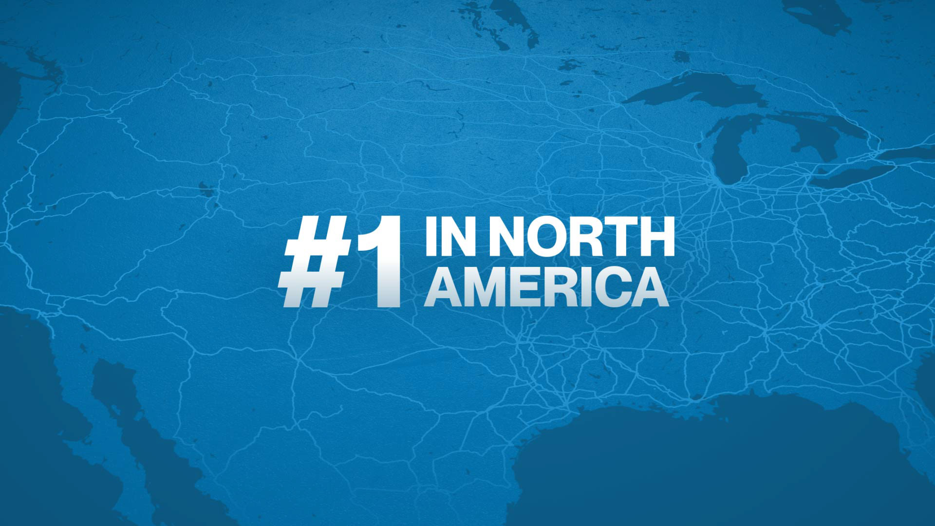
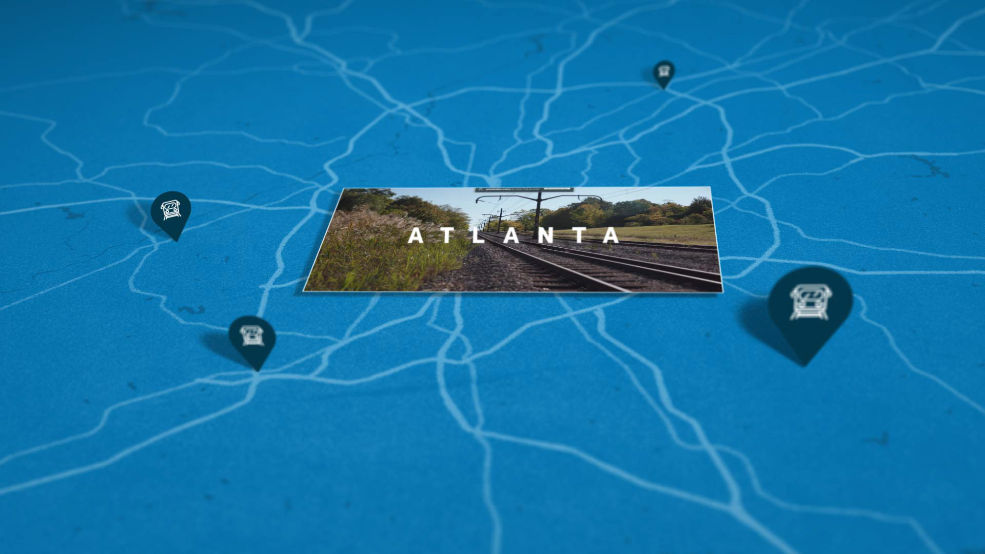
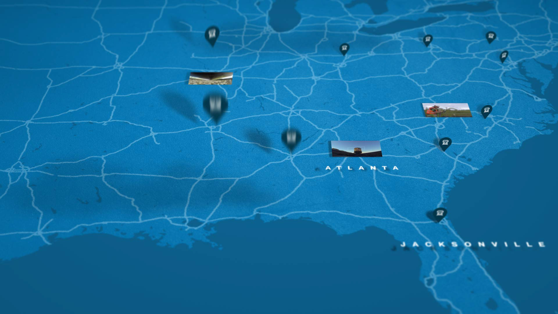
Map scenes with text callouts
Map scene transitions
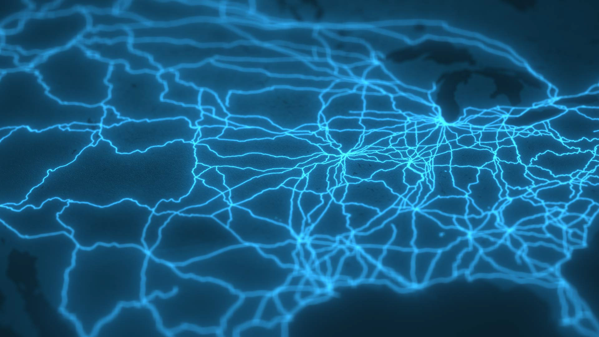
Map scene
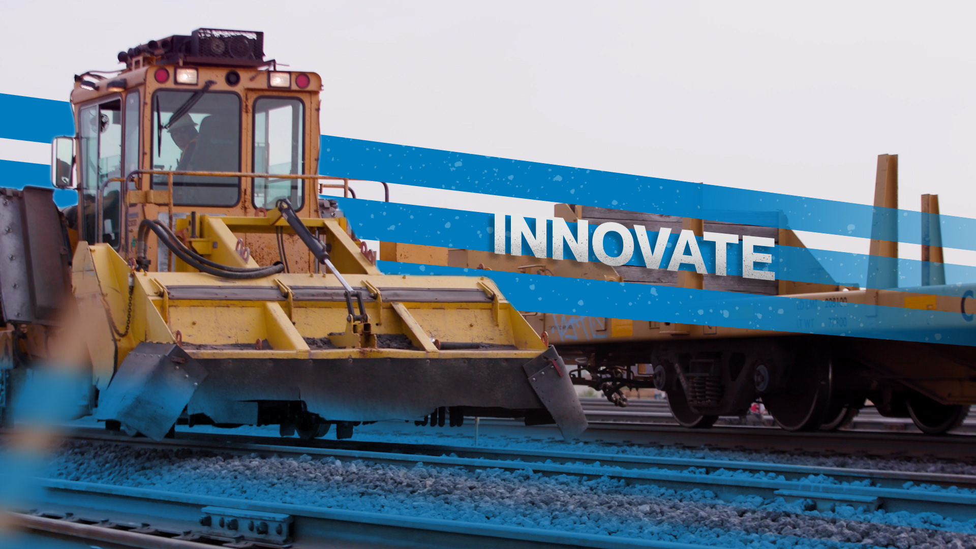
Examples of callouts within pre-existing footage
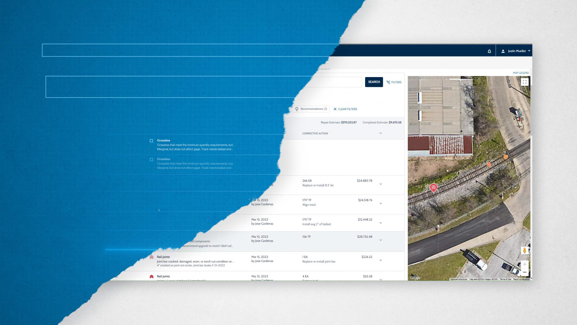
End card

Software scene transition

The process
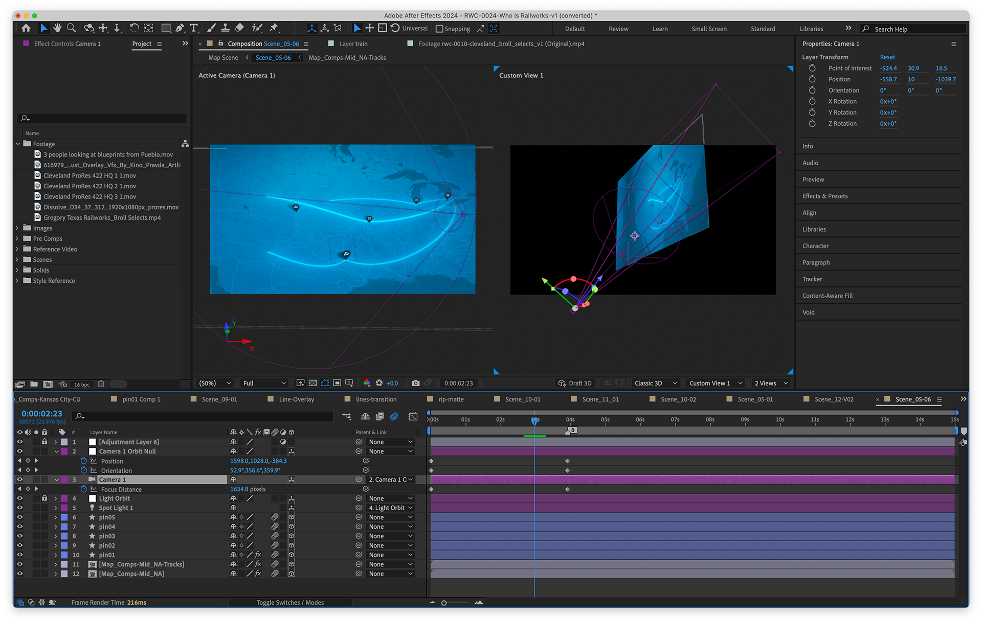
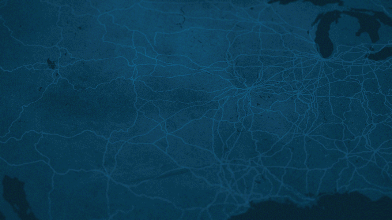
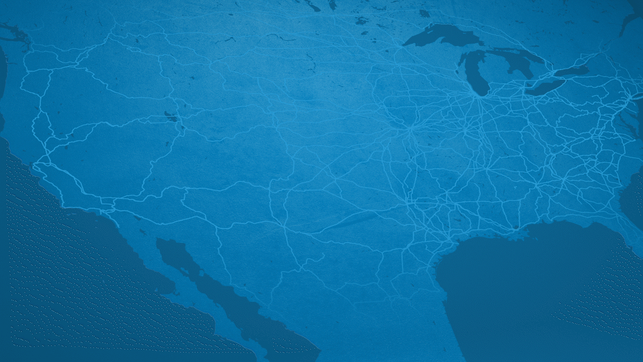
After we got approval on an edit, I was able to move into animation and work on animating with the VO / rough cut. The bulk of the work was contained within After Effects and the map scenes. I started by gathering some vector assets of a map of North America. I then cut had to source info and images of all the railroad routes and find a way to overlay that on top of my map. Then I turned everything into a 3D composition and started with the camera. After that, I used some effects to make the map look rougher, with more grit. The client really wanted to make sure the video has a blue collar feel. Their team is proud of their work on the tracks and wanted that feel to shine through in the video.
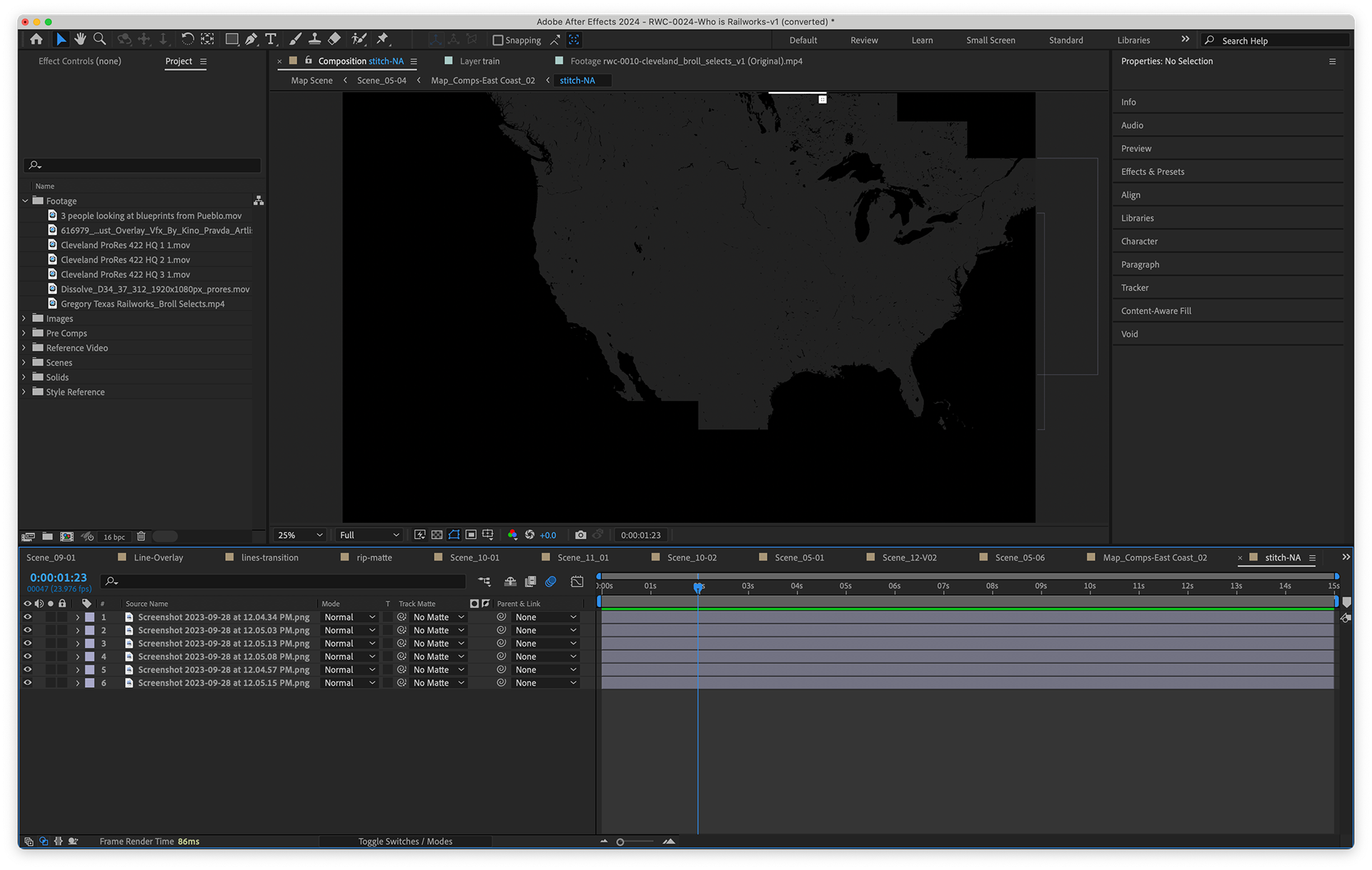
Stitching together screenshots of map of NA
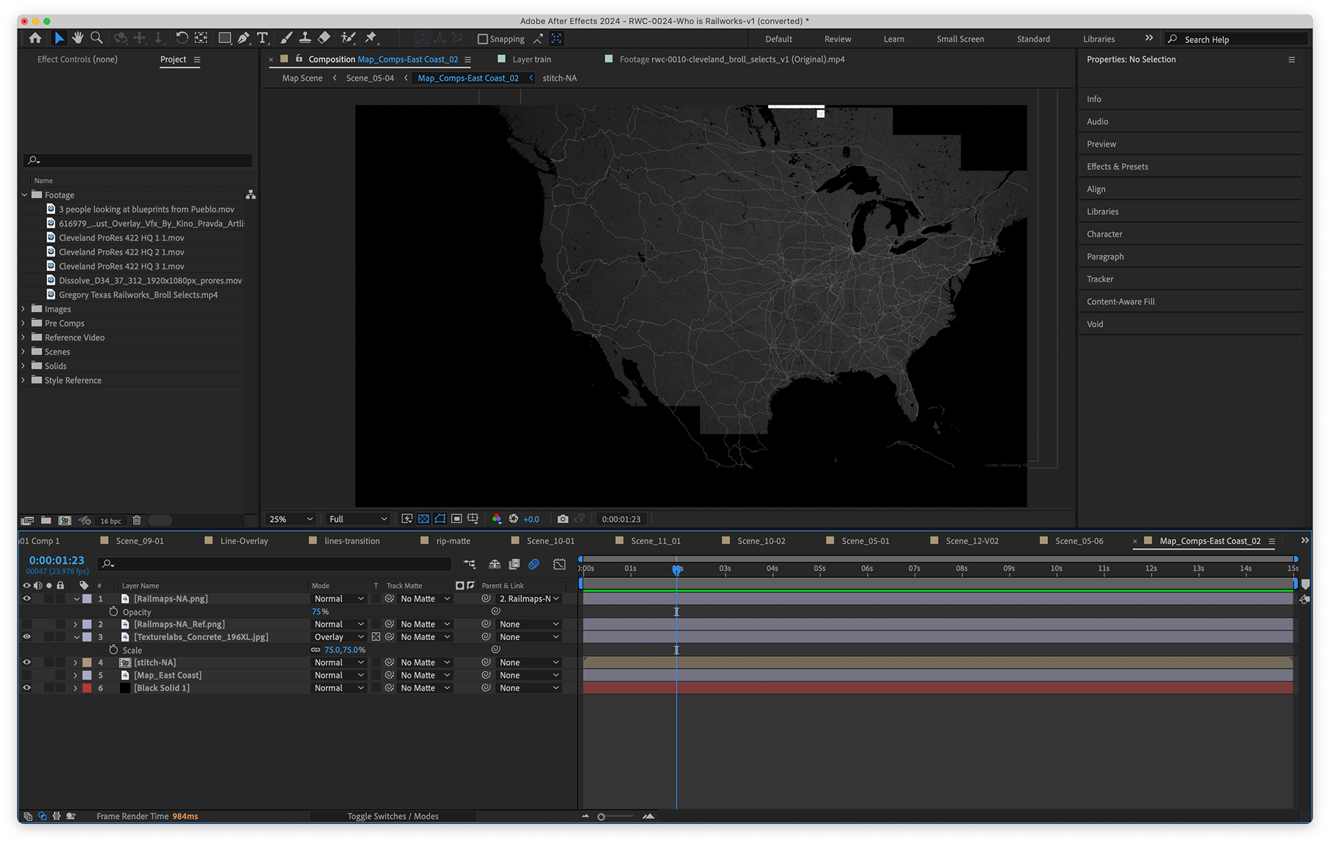
Adding texturing and effects to the map in a pre-comp
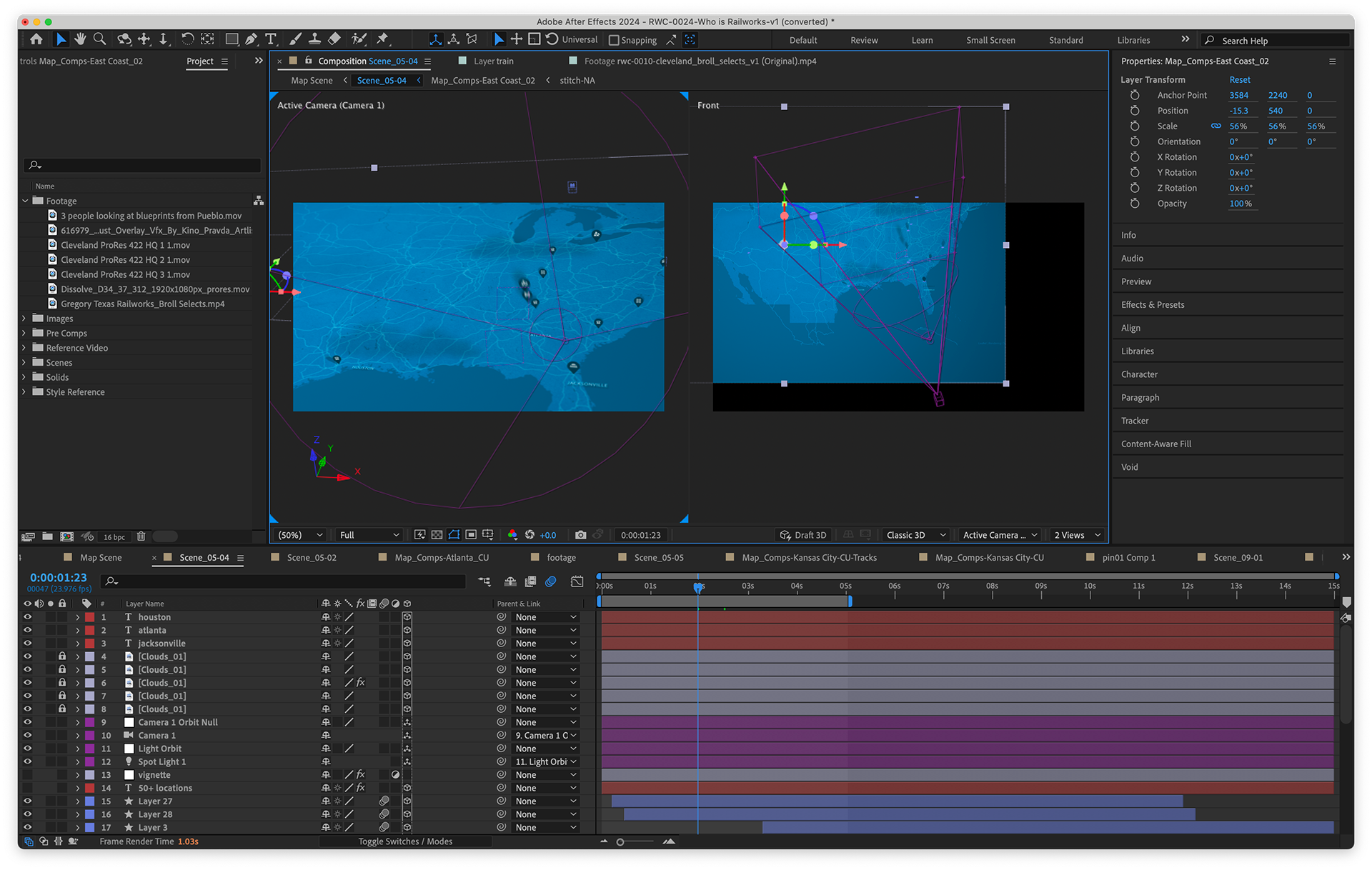
2 view of how the map was converted into a 2.5D map
Animation
My role: Design, Animation, Art Direction
Client: Railworks
Agency: Manley Creative